As promised and a bit late due to the craziness lately, I have the next half of my glam workspace reveal for you! Are you ready for round two?
part one recap
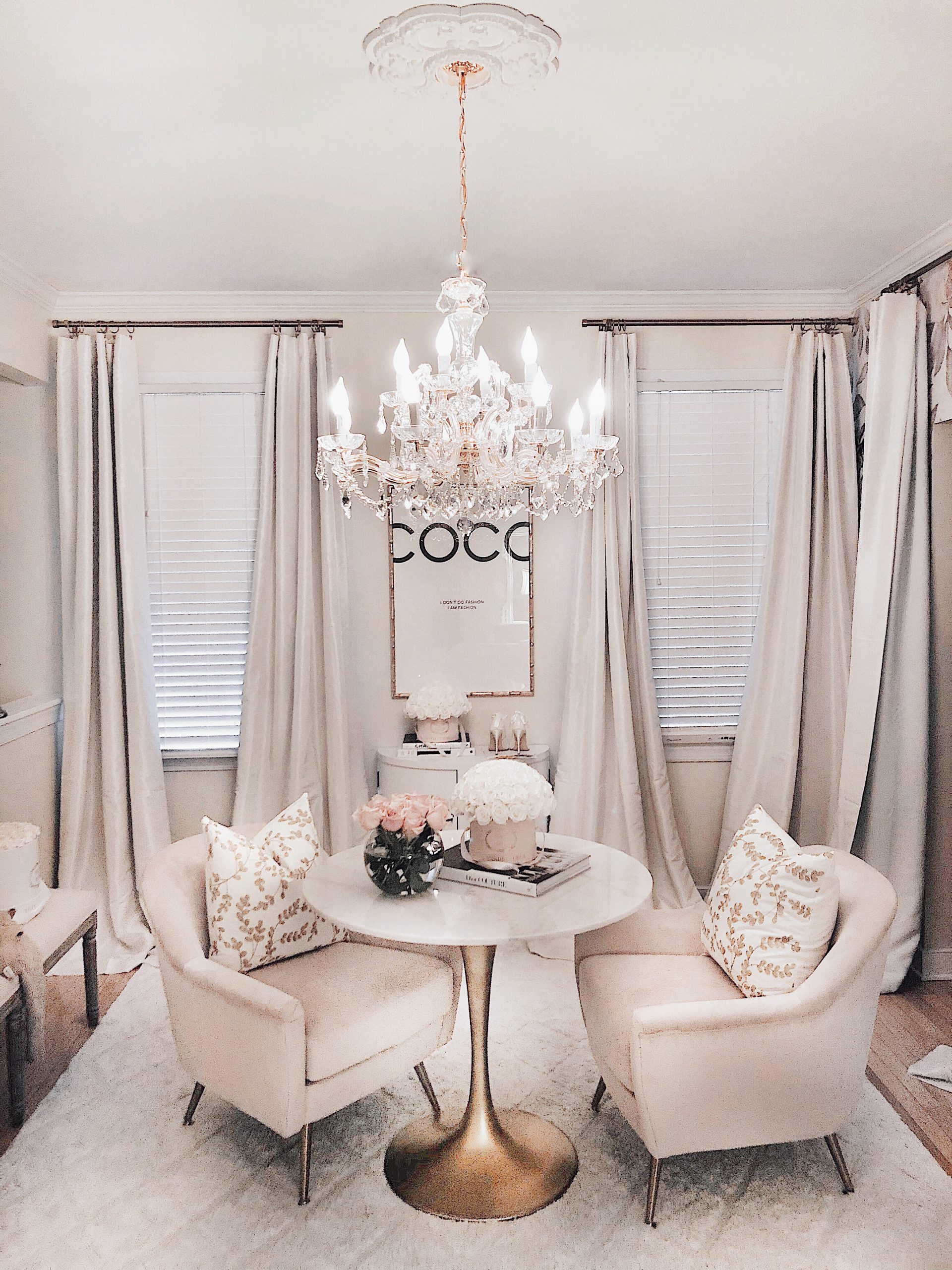
In part 1 I showed you a slightly different look because I wanted to keep things interesting and also get your input as to which style you prefer. The main difference being the French chairs that were shown in the first. In this post you’re seeing these beautiful blush velvet chairs by Safavieh. Both styles of chairs are actually by Safavieh.
the blush velvet chairs
When designing the concept of this space I couldn’t get those blush chairs out of my head. I just KNEW that they had to be here. The velvety details with the soft blush color bring that feminine glamorous touch to the space that I was dreaming of.
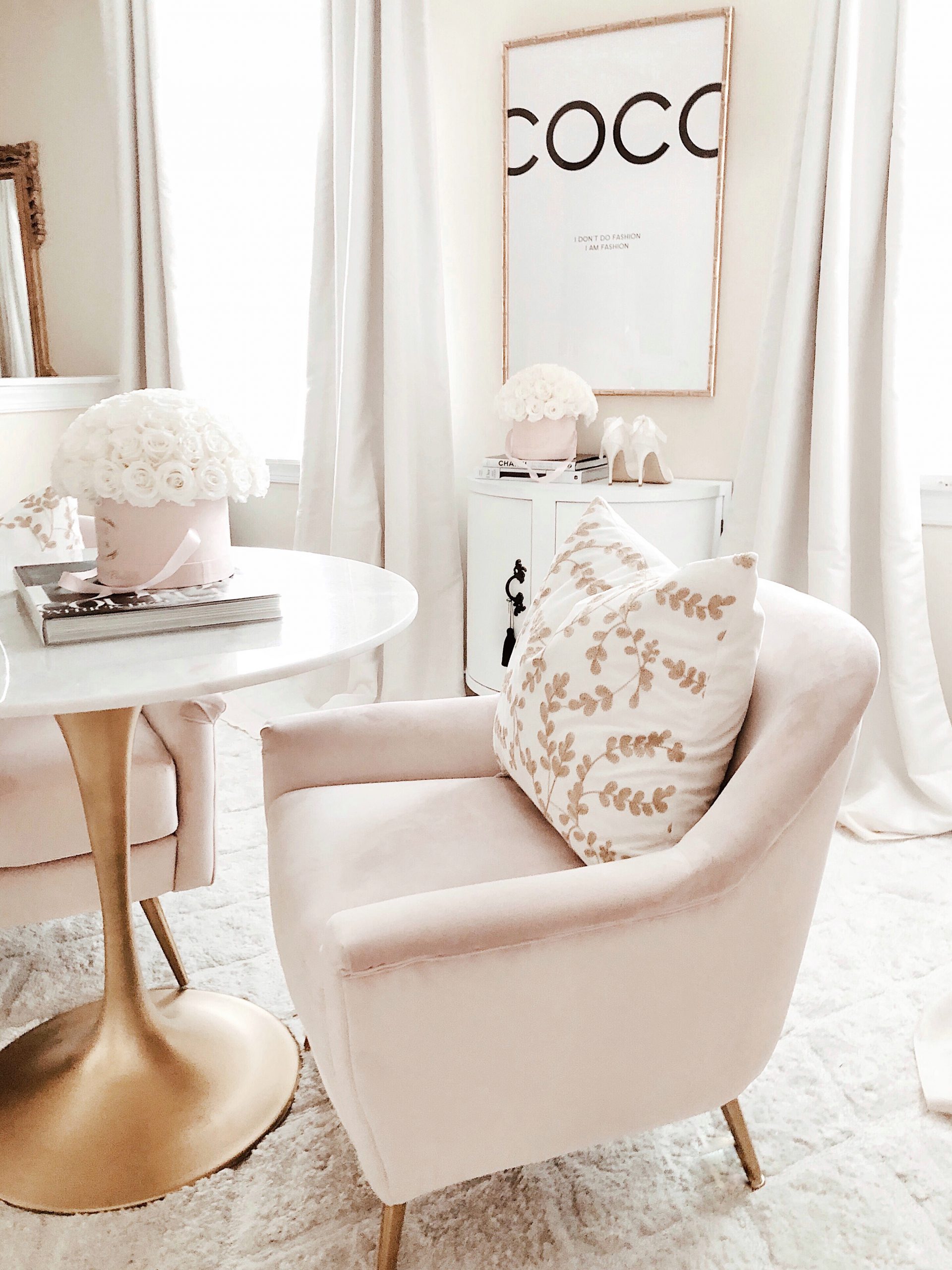
I find them to be so incredibly inviting and that’s exactly what I needed for my newly designed workspace.
Find the blush velvet chairs here & the french chairs here.
the challenges
In part 1 I briefly touched on the fact that before, I had issues when it came to actually using this space, and one of the main problems was that I just didn’t find myself drawn to this space. I actually felt more like I wanted to avoid it.
Now this wasn’t because the room was ugly or anything. I believe it was more because of the fact that the space was like a smorgasbord of pieces that really didn’t belong together.
To make this room, that had the original purpose of being a dining room, work it would need pieces brought it with consideration of the room design. The furniture that had worked well in other rooms just wasn’t going to work for this space.
What I found most exciting about this transformation, was that it was more doable than doing a wall busting, home reno kind of challenge. I could make this room really work for me within the constraints that I had.
Moving forward I wanted the room to have minimal pieces inside so that it would translate to me having more of a clearer mind. Does that make sense? Too much clutter and my nerves are just all over the place. That doesn’t translate into a productive space for me.
As I mentioned in part 1, I knew I had to have a round table at the center of the room. I then decided to build the essential furniture pieces around that.
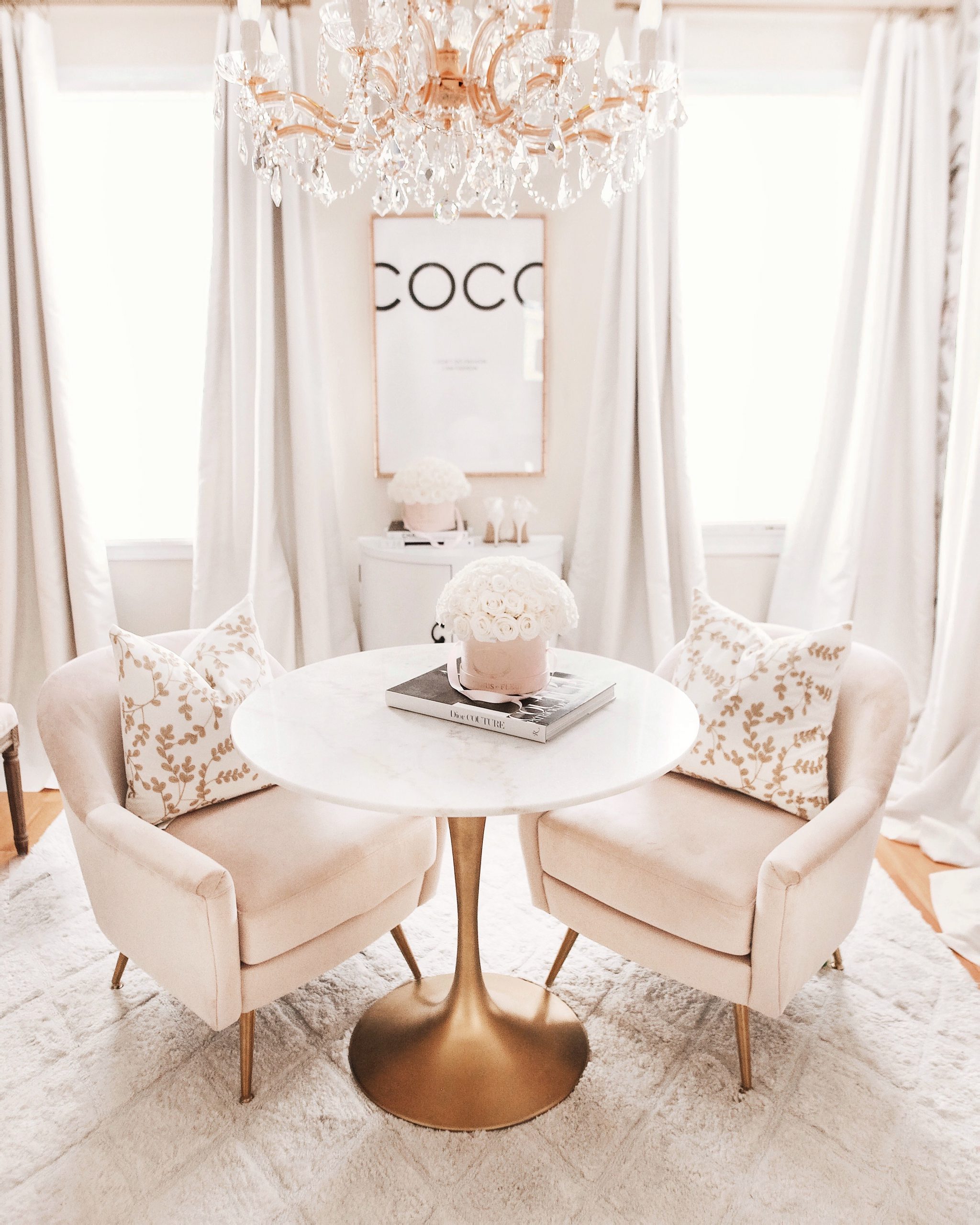
I have always been excited about the idea of having a nice sized table solely for work. Whether that be creating something with my hands, working on my planner or popping open my laptop here and there. I wanted something that could be free & clear of anything, at any time.
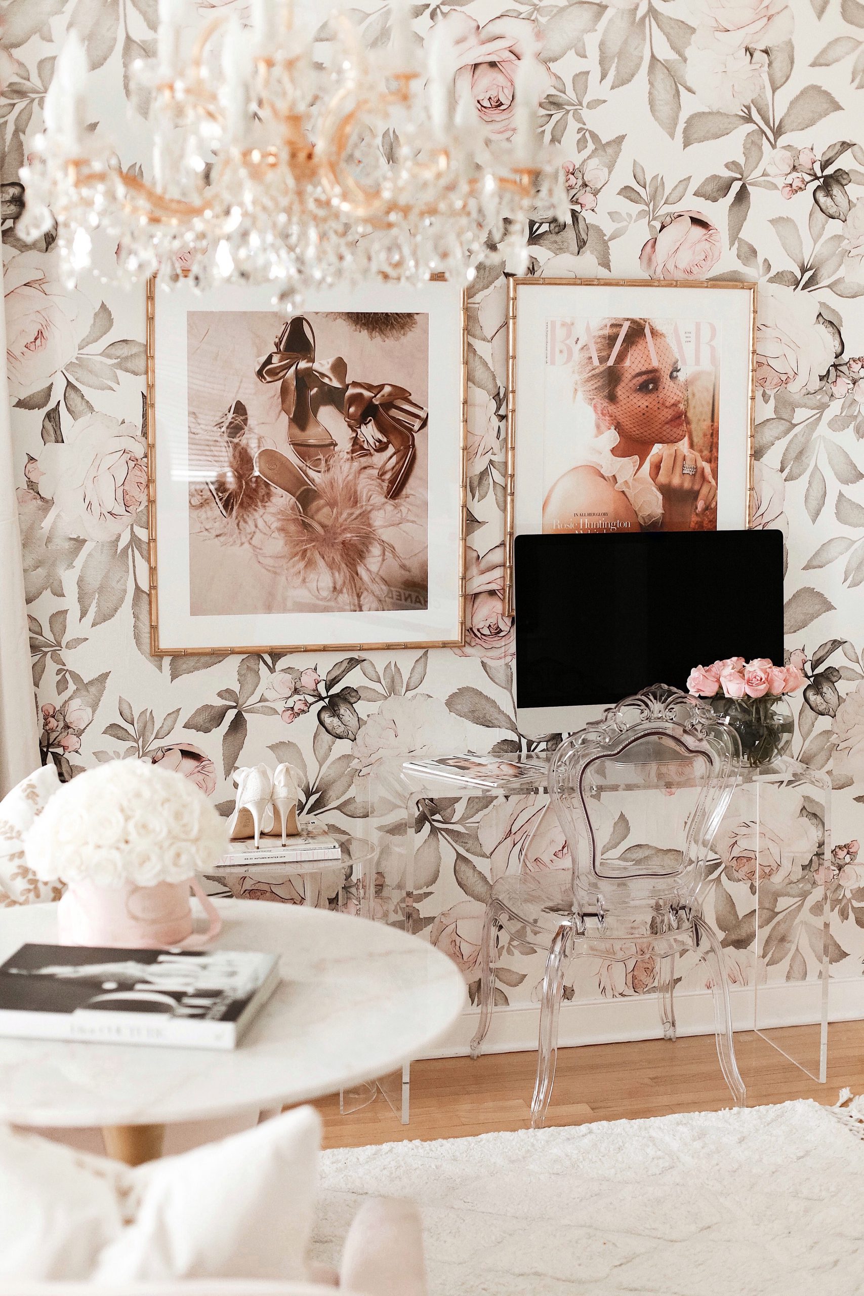
And that is why my desktop needed its very own table to call home that wouldn’t take up much space.
I chose acrylic furniture for that segment of the room to again, have more feeling of openness in the space and less clutter.
the Chandelier
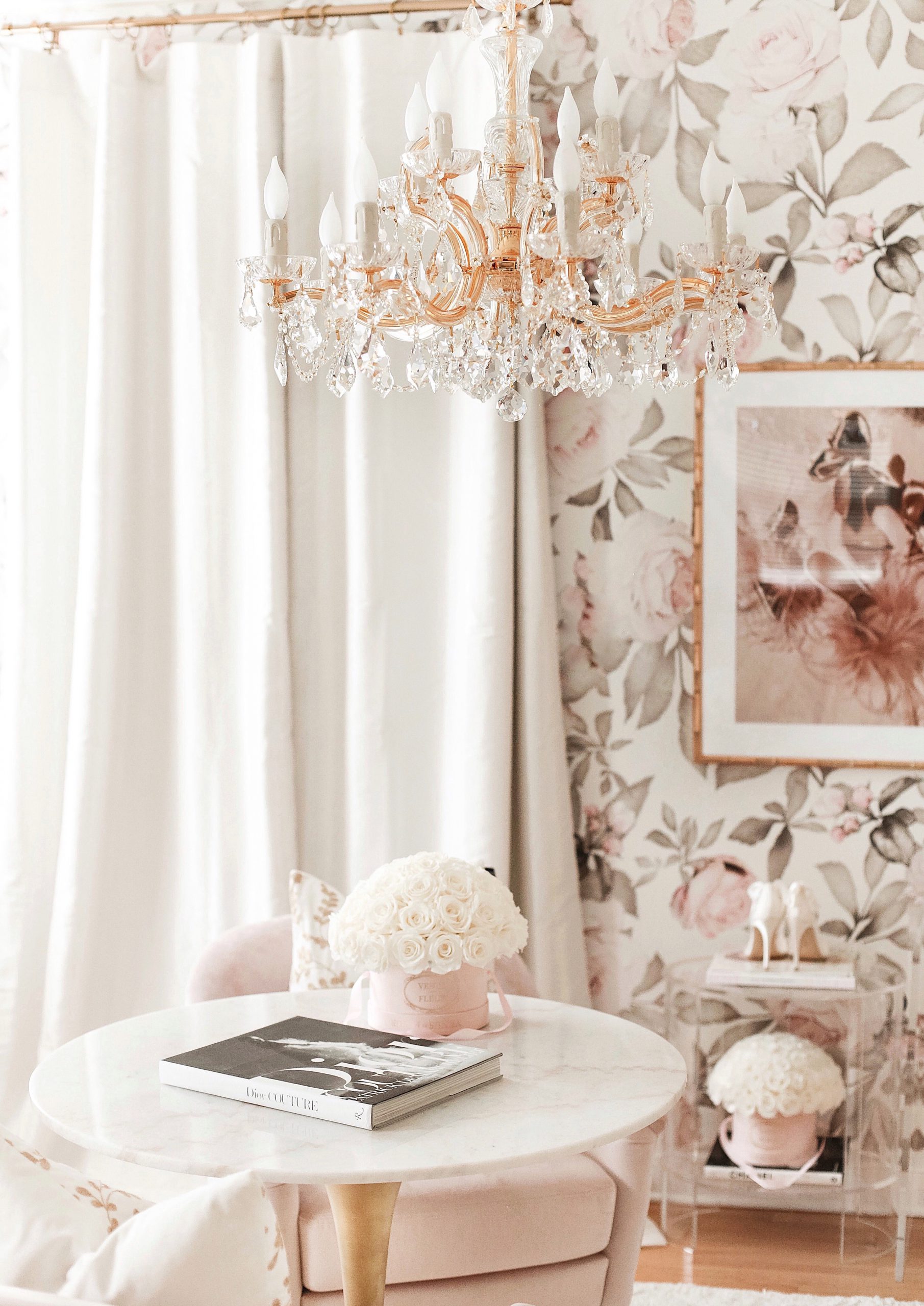
My absolute favorite and I mean FAVORITE addition to the new space, is hands down, the GORGEOUS Maria Theresa chandelier by Crystorama.
Honey there’s no way that I could keep it short and sweet in any attempt telling you just how much I’ve wanted one of these chandeliers. They are 100%, absolutely classic, timeless and oh so glamorous.
Ever since it was installed, like a crazy person, I would find my self walking back and forth past the workspace just to admire it’s beauty.
It’s just that beautiful.
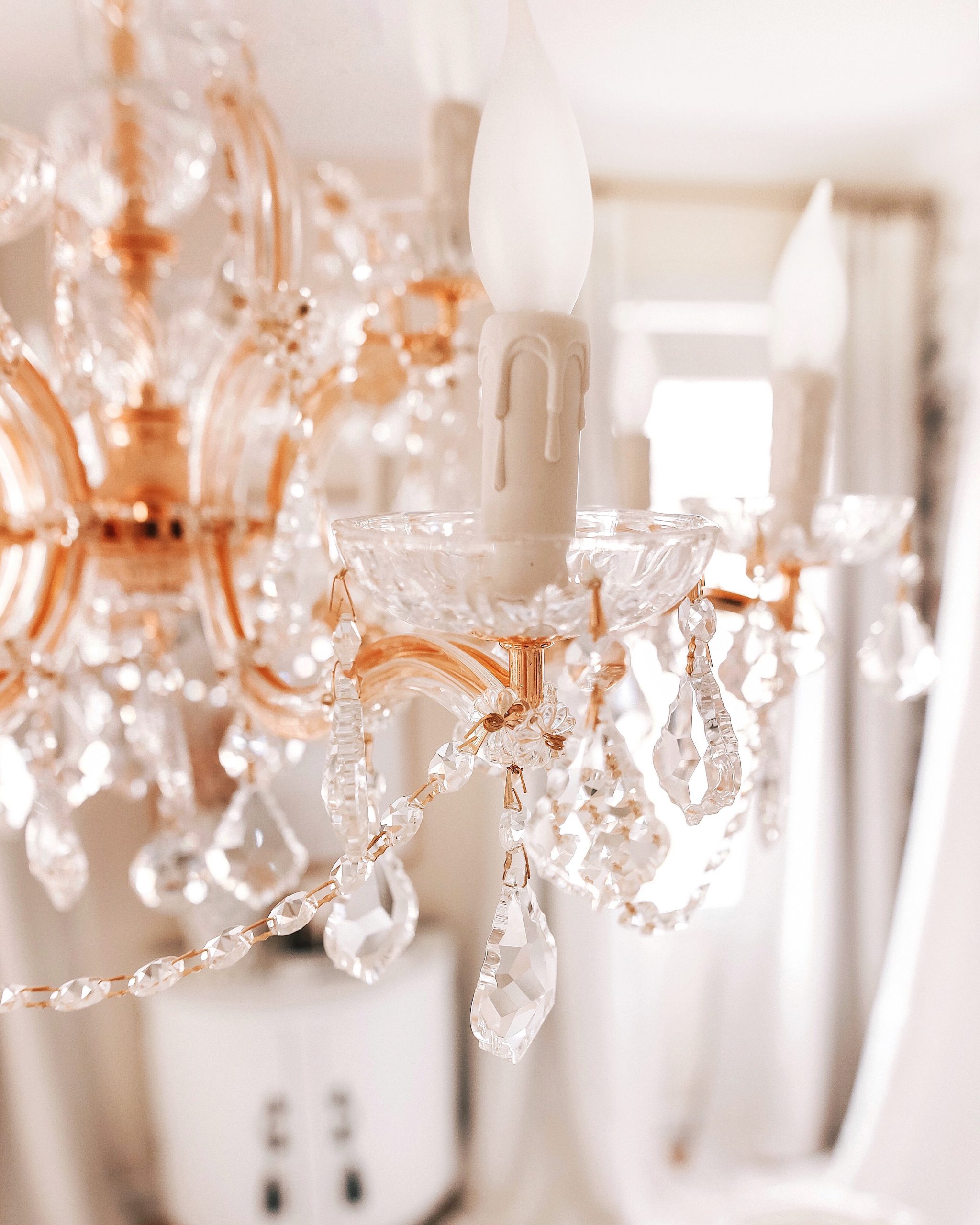
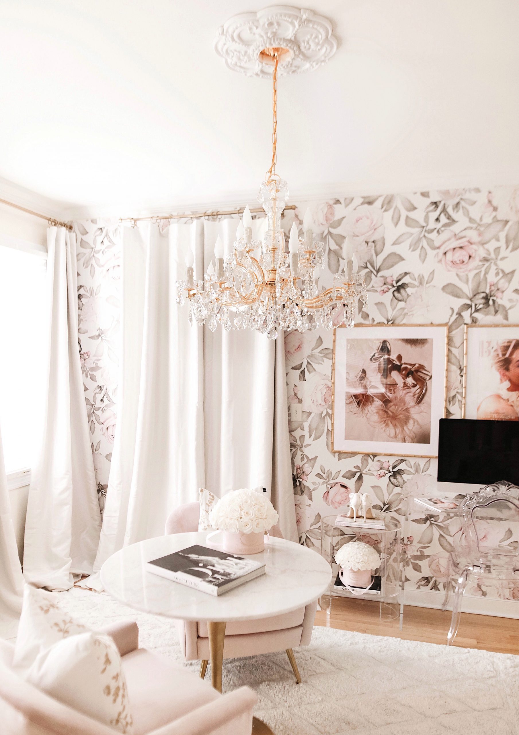
Crystorama has such an incredible selection of light fixtures, especially Maria Theresa chandeliers. You’ll find crystals with more width or with more length.
For this space, I absolutely wanted a wider crustal chandelier. I wanted it to be a focal point of the room, something you just couldn’t ignore. There’s such an array of light fixtures I could have selected instead of this one so I’ll tell you a bit more why this just had to be the one.
If you look at the before photos you’ll see the original black iron light fixture that came with the home. You will then see the chrome crystal chandy that was here after that.
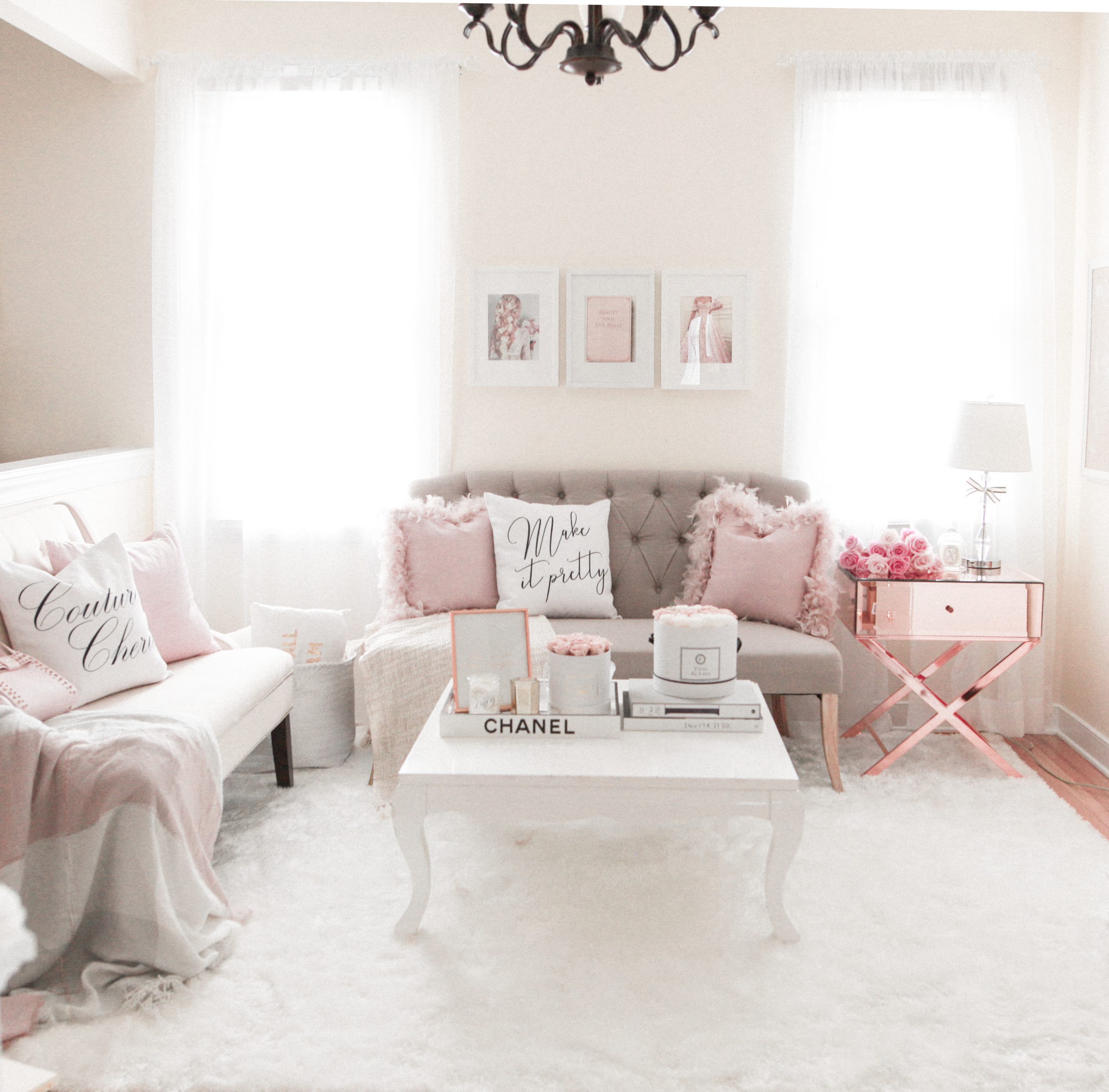
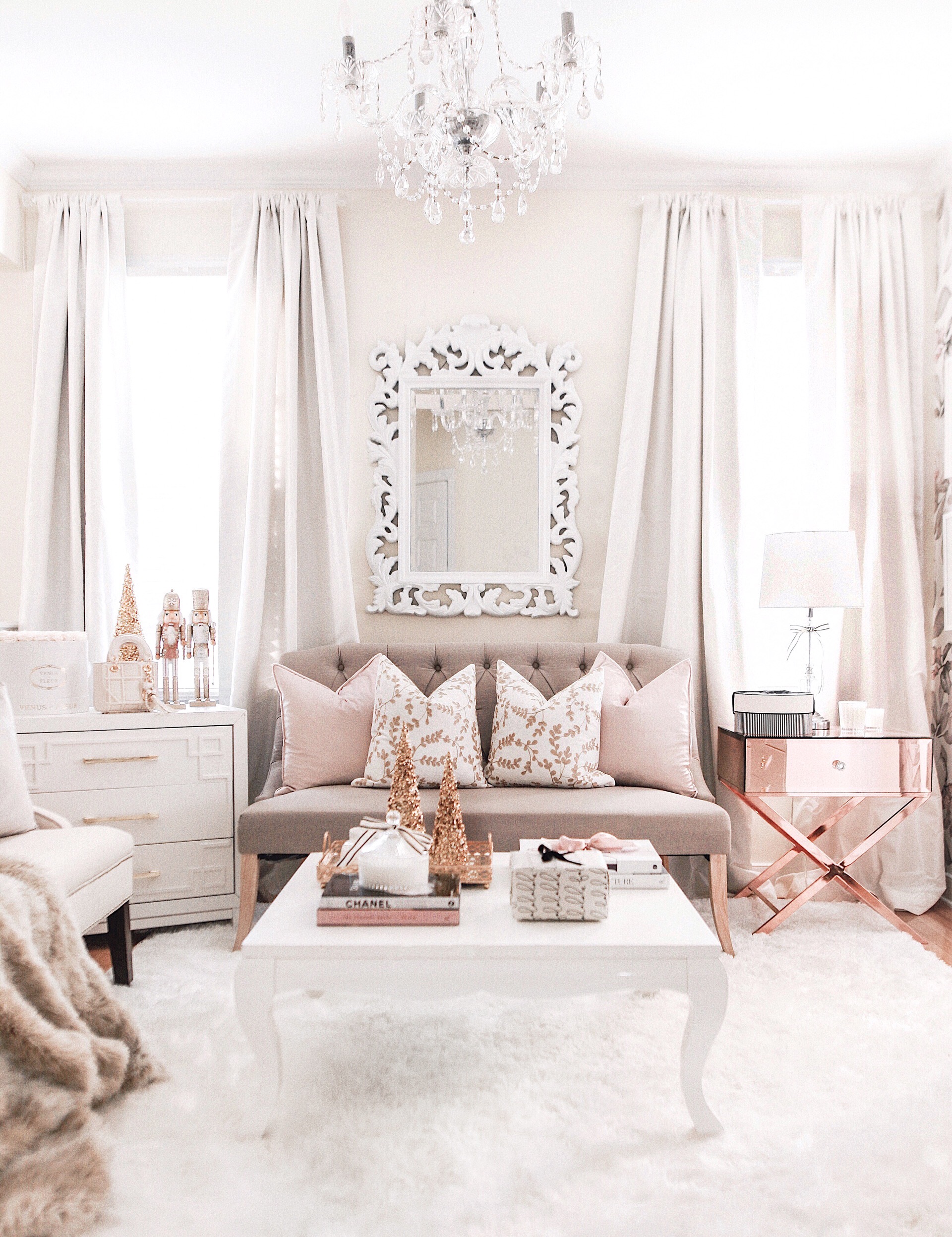
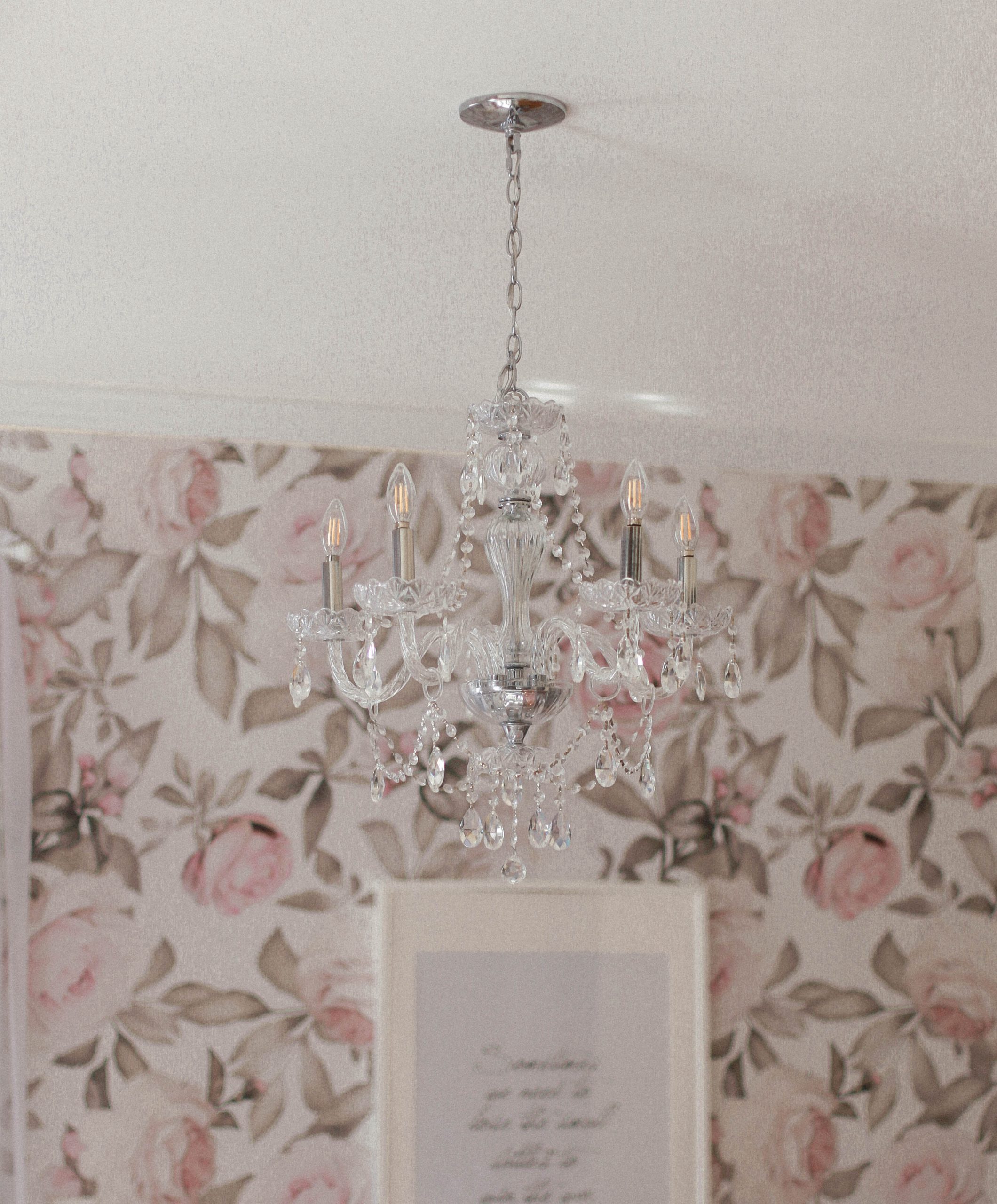
The first thing you should know, it wasn’t a Maria Theresa so my heart wasn’t really sold on it. The second thing you should know is that it wasn’t GOLD.
That’s a crucial fact, because I love gold accents. This new space was going to have gold accents in just about every space you look, so it was essential that this be fixed. I’m a little ocd about things not quite matching up.
The foundation for a lot of the spaces that I put together and love, is built on something timeless and elegant. So even though I may choose a table that’s a bit more modern like the tulip marble one here, I gravitate towards adding in timeless pieces like this light fixture to round out the look.
Say that I eventually choose to get rid of the modern pieces here, I know I’m still going to love this classic chandelier weeks, months or years from now.
I won’t feel the need to switch it out. That is because it pairs beautifully with elegant-traditional pieces and moderns pieces as well. It’s versatile & elegant and that is why I chose this.
Remember this when light fixture shopping, these pieces will be the jewelry to your home and when making selections, you should want them to look just as beautiful as any pair of glamorous earrings or necklace that you would wear.
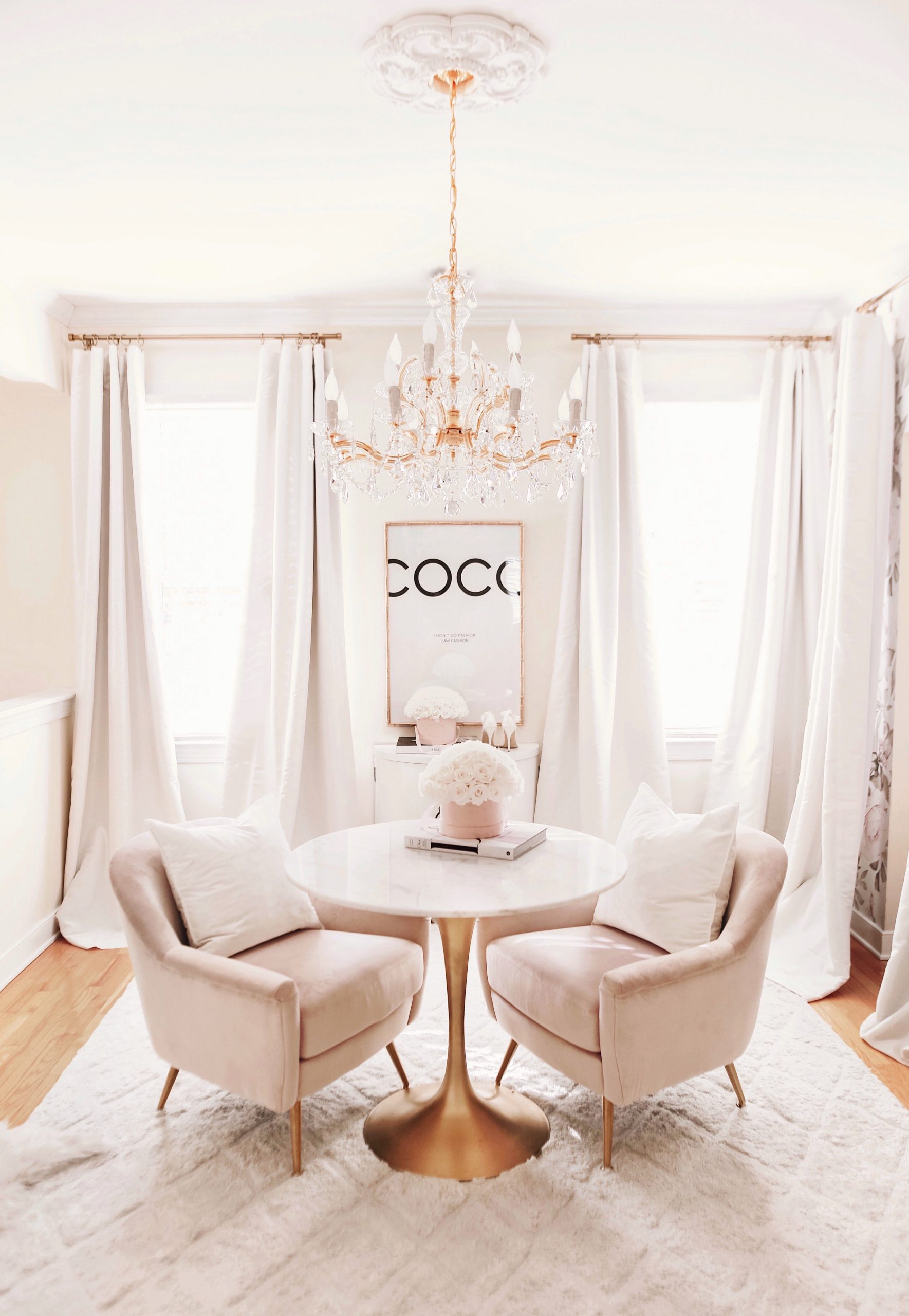
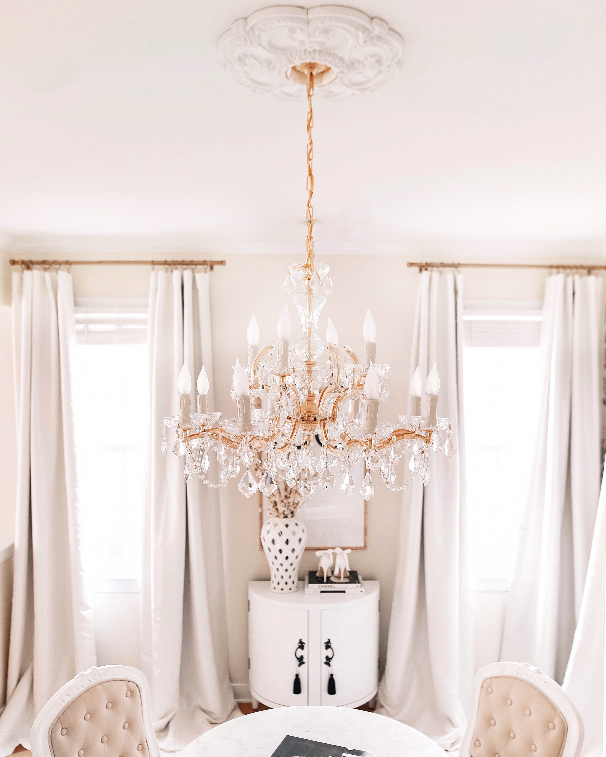
Before you buy, make sure you truly love the piece. I know this is hard when shopping online because items may differ in person but there are ways around this. Do your research and copy the SKU number for the light fixture your eyeing and paste it into google.
From there look for reviews which usually will have more photos. Social media is another great way to find real life pictures of the light fixtures you’re eyeing. Just search the company’s instagram and tagged photos.
If you have the resources, use photoshop to create a mockup of your current room. Drag the image of the light fixture onto the photoshop file and search for images similar to the pieces that you already have in your room and do the same.
This will take some time but it will also give you an even better idea as to how the lighting will look in your space.
the medallion
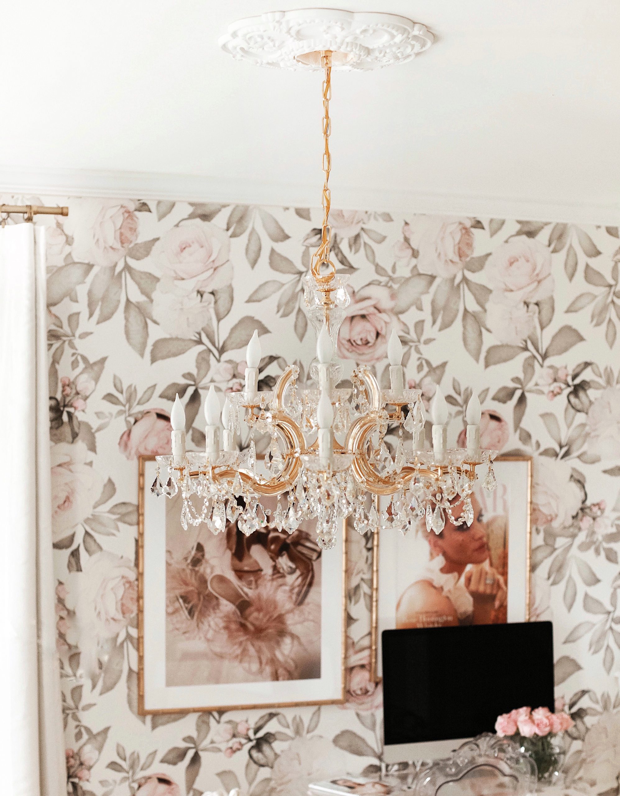
I paired the chandy with a lovely little medallion. Together they make my heart just explode!
When it comes to medallions you have two options.
Putting it up before adding the new light fixture or after. This time we had no choice but to add ours after the light was installed. So we bought a split medallion to do the job and used liquid nails glue.
Find the chandelier here and the medallion here.
before & afters
What’s a good reveal without before & after images?
For this makeover, I really wanted to focus on finding solutions for the things that drove me most crazy about the room.
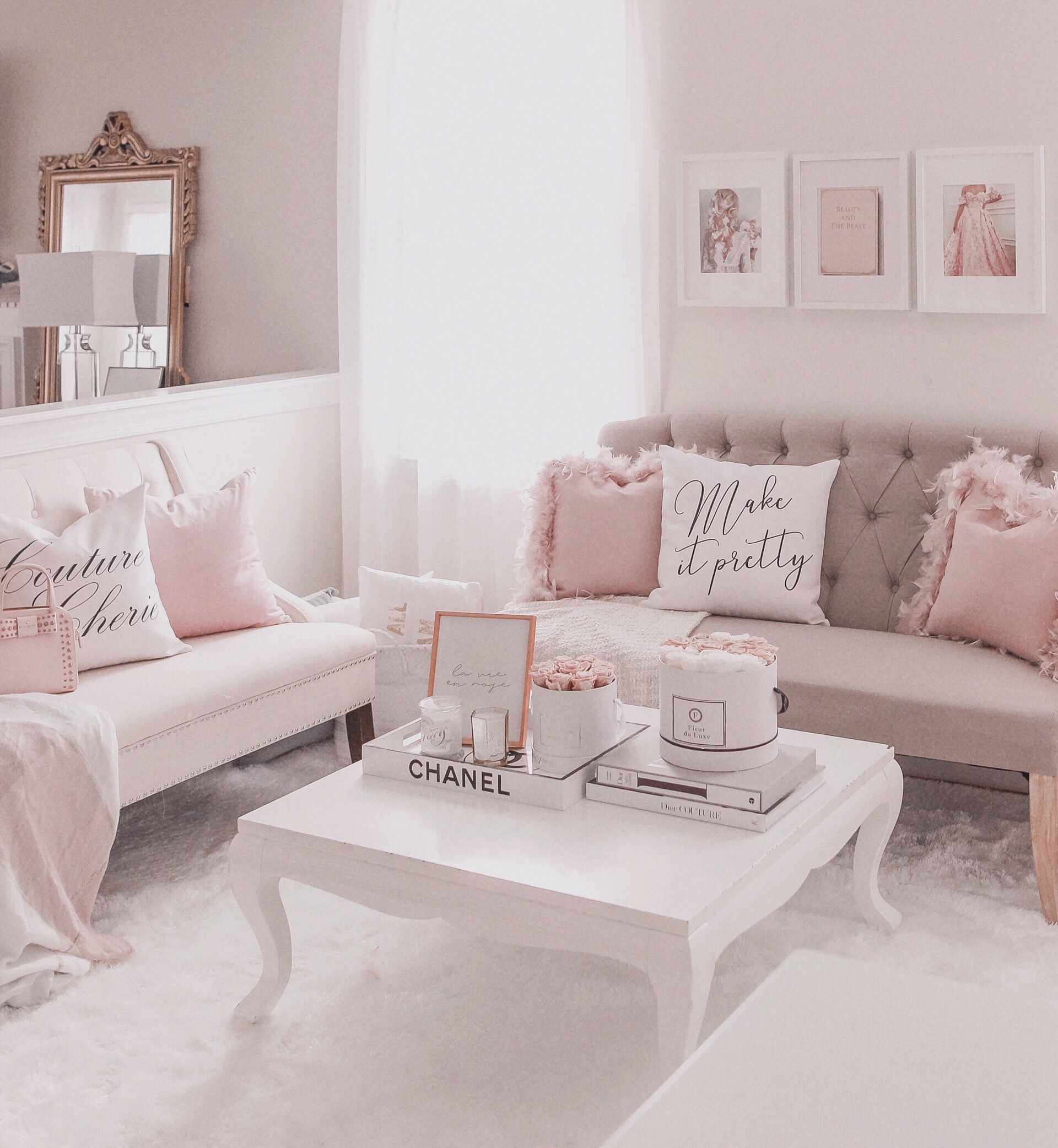
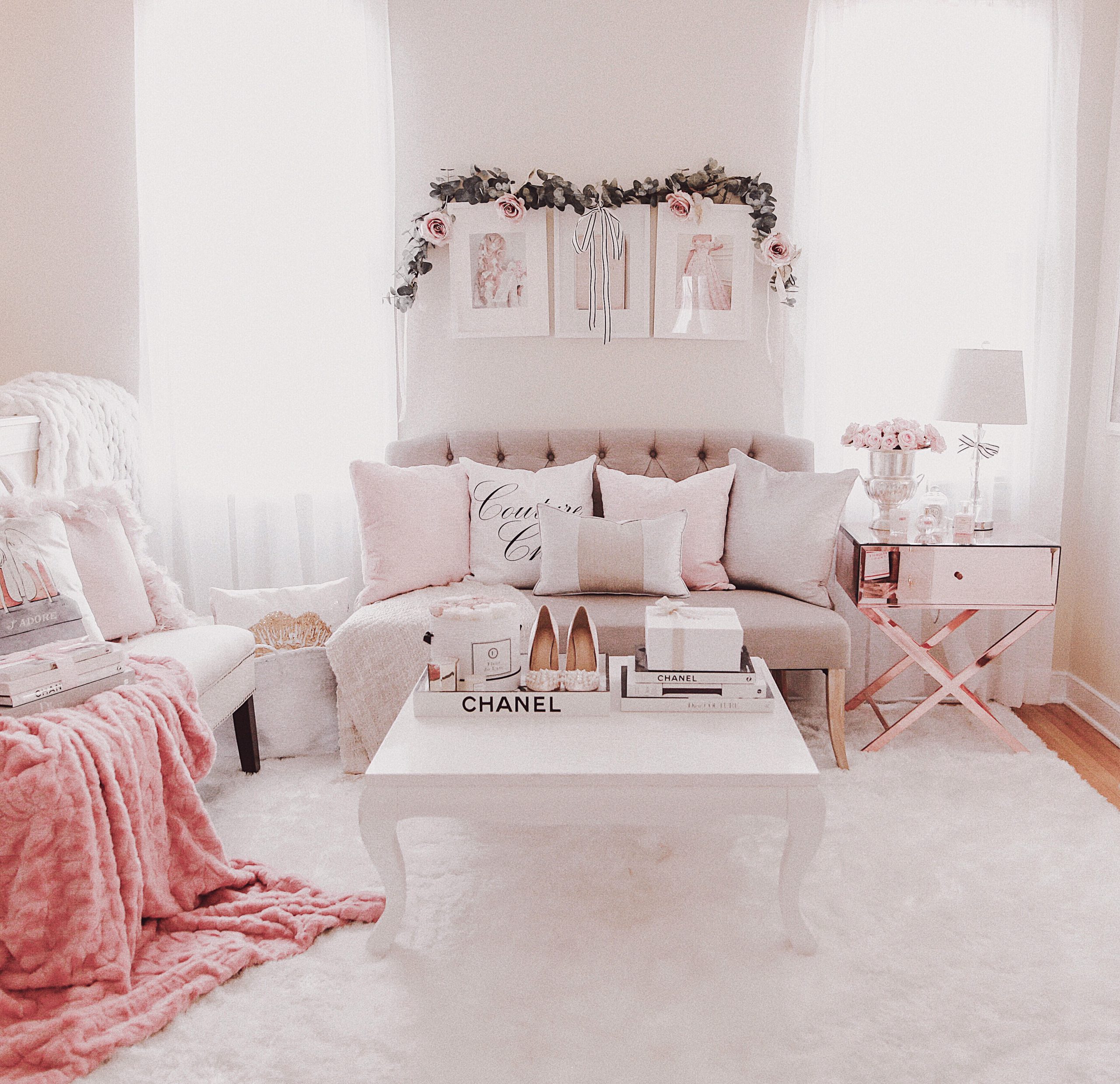
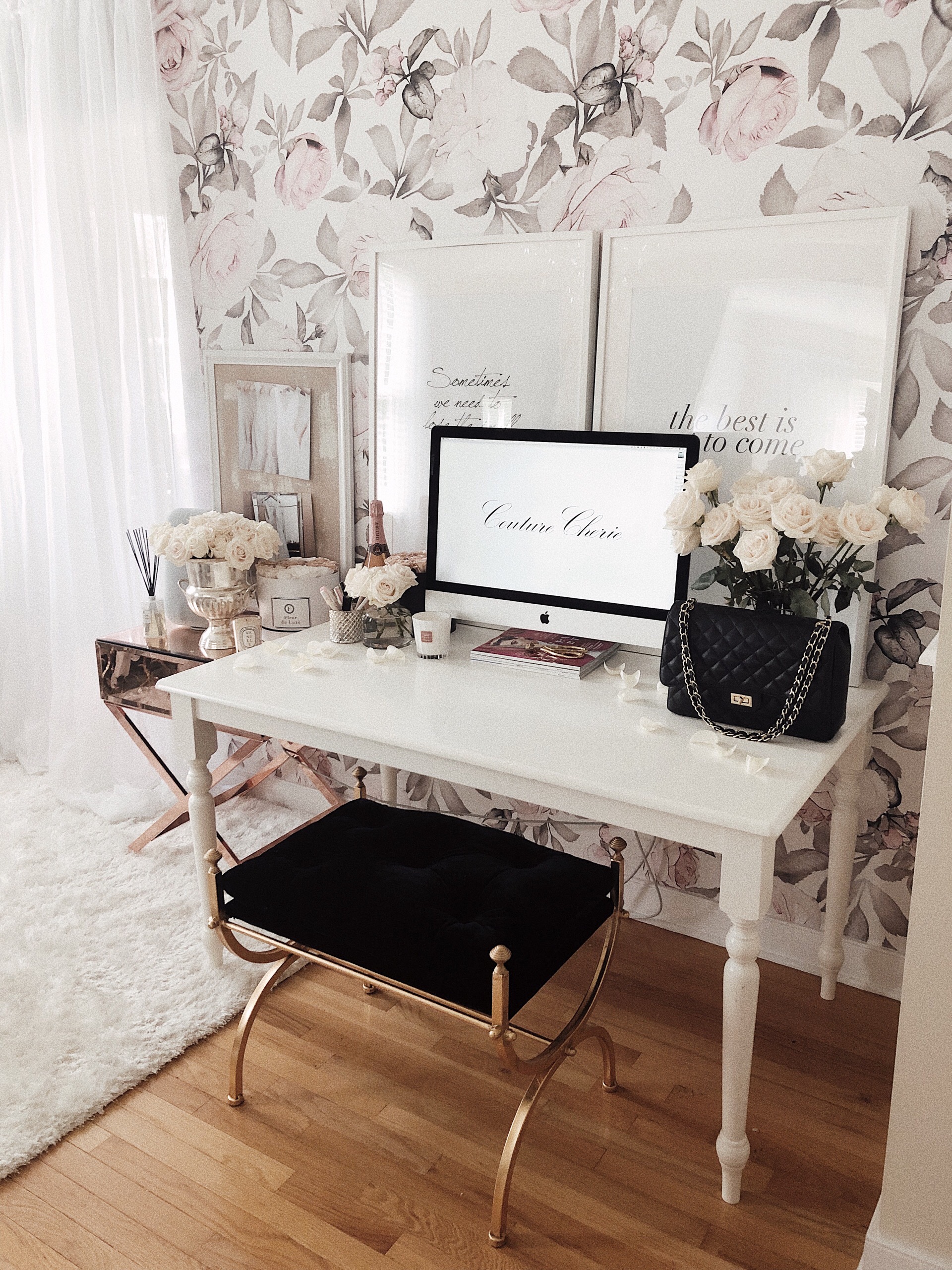
I can’t stress enough how much the awkward half walls in this space drive me crazy. It’s something that I can’t change. However, I felt that by removing the furniture that had lined the walls, I would focus less on their existence.. And that’s why I opted for a circular round table in the center, to bring focus more on the center of the room instead of the walls.
The other thing that really drove me bonkers was the door entry from the kitchen into this room. There’s no actual door and the the height of this entry is shorter than any other opening in the walls or entry in our home. It’s just so incredibly awkward. And for a glam workspace not ideal.
I don’t want to be able to see the dirty dishes from my glam space. With 3 kids I struggle on most days to get them done right away, such is life.
Before, I tried fixing this issue with curtains. The problem I had the first time was how quickly they were yanked down by my children. Always the children lol… So initially with this revamp, I tried to see if I had any other options. If I wanted to avoid doing any kind of construction, I didn’t have much options.
So back to the curtains I went.
As I mentioned I didn’t really want to do this option again but with extra steps to make it more secure it so far has been working. It has really helped to hide this little spot that I don’t like while seamlessly blending in with the look of the windows and the overall space. To me that’s an improvement!
If you look at the styles of this room before to the new look, you’ll see just how overcrowded this room was and how much better it flows now. At least it’s better now for my needs.
the drapery
Speaking of the drapery you’ll find these beautiful faux taffeta silk curtains available here.
After trying so many different drapes & textures out I’ve slowly acquired these drapes for all of the windows in my home. There’s just something so darling about the way they reflect the light, just like a pearl. LOVE them.
The drapery hardware you’ll find here. I really love the gold and overall design of them. They feel solid and high quality.
the wallpaper
At one point last year, I actually had all of the walls in this space lined with wallpaper. At first I liked it but after some time it began to feel like too much. And what was truly problematic about it was again, the half walls.
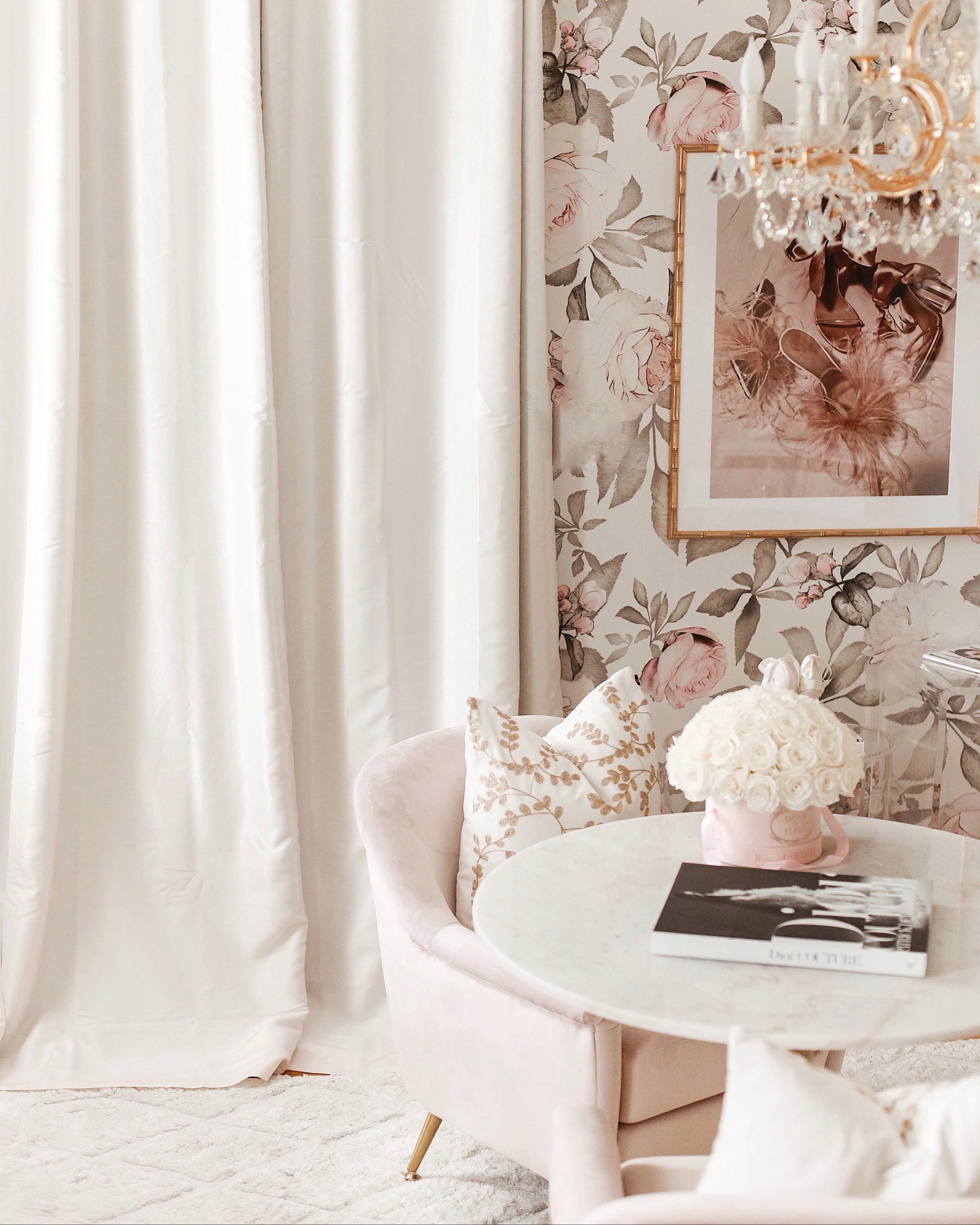
The wall with the windows is actually a very long wall that goes on for about another 30 feet. What is so awkward about it is that there is this half wall dividing it. So when it came to wall papering just this space, it remained awkward because we were essential stopping the wall paper in a random spot of a long wall.
Long story short, the room looks so much better with keeping the florals as an accent wall, aligning with the computer table. You still get the romantic & elegant vibes with the space but you’re no overwhelmed by it.
Find the wallpaper here.
the ghost chair
For the computer table, acrylic everything became the way to go. I tried other options and it just didn’t seem right. This style continues the theme of giving the room a less cluttered feel while remanning elegant all the way. Find the chair here.
the frames
My absolute go to place for frames are Framebridge. I’ve been so happy with all of the work they’ve done for my home thus far that I knew I had to have more for this space. I selected my own glamour-themed prints to send to them and chose the blush bamboo frames. Find the frames here.
final notes
From my very first thoughts on redoing this space, I stressed constantly over making the dream I had for this room, a reality. Until the very end, countless times I would move little things around over and over again to get this space just right. After all that I feel so relieved that I created a new concept for the room that will actually encourage me to use this space.
I hope that you enjoy it just as much as I do & feel inspired yourself to make some changes to your spaces as well. After all you might have more time now more than ever to make it happen!
xoxo
